The Film Pitch Deck Cover: Title, Tagline, and Key Art That Set the Tone
Your pitch deck cover is a movie poster for a film that does not exist yet. Here is how title, tagline, and key art work together to make a producer turn the page.
The Film Pitch Deck Cover: Title, Tagline, and Key Art That Set the Tone
Before a producer reads your logline, your synopsis, or your team page, they see one thing: the cover. It gets two seconds — and in those two seconds it does the same job a movie poster does in a theater lobby. It tells the reader what kind of film this is, what it feels like, and whether the person pitching it understands tone. A cover that gets those three things right earns the page turn. A cover that gets them wrong quietly downgrades everything after it.
Here is how the three elements of a cover work, and how they work together.
The Title: Set It Like a Poster
The title is the largest text on the cover and the only text guaranteed to be read. Two rules matter more than all others:
Set it in a display face, not a text face. A title in the same font as your body text reads as a document; a title in a distinctive display face reads as a film. This is the single fastest way to make a deck look like it came from someone who understands how films are presented.
Let it breathe. The title needs clear space around it — no logline crowding underneath, no contact details competing at the edges. On the cover, the title is the event. Everything else is supporting cast.
The Tagline: Tone in One Line
The tagline is the cover's voice. Its job is not to explain the story — that is the logline's job, and the logline belongs inside the deck, not on the cover. The tagline's job is to make the reader feel the film's register: menace, wonder, intimacy, dread.
The reliable tagline patterns are compression devices: the paradox ("In space, no one can hear you scream"), the scale claim ("He is three million light years from home"), the double meaning, the warning. What they share is brevity — under ten words — and specificity of feeling. A tagline that could sit on any thriller's poster fits yours no better than the others. (We wrote a full breakdown of the difference in Loglines vs. Taglines.)
The most common cover mistake is swapping the two: a plot-summary logline where the tagline should be. The moment the cover explains the story, it stops being a poster and starts being a memo — and the reader's expectations drop accordingly.
The Key Art: One Image, One Promise
Key art is the image that would sell the finished film. On a pitch deck cover it does three jobs at once:
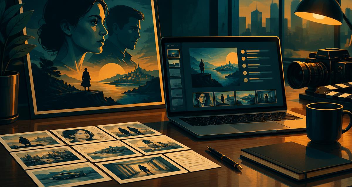
It declares the genre before a word is read. A lone figure in fog, a neon-lit street, a sun-bleached farmhouse — the reader's brain categorizes the film from the image before the title registers. That categorization must be the one you intend. Key art that reads as horror on a family drama does not intrigue; it confuses.
It proves visual intent. A producer reading a deck is asking, among other things, "does this filmmaker see the movie?" Strong key art answers yes before the director's statement is ever read.
It sets the palette for the whole deck. The cover's colors, mood, and typography should carry through every slide — the deck is one designed object, not a cover stapled to a document.
A practical note on imagery: AI-generated key art has become standard in pitch decks, and it is entirely appropriate for materials that exist to sell a vision rather than depict a finished product. What matters is that the image is specific to your film — its world, its palette, its feeling — not generic genre stock. An image generated from your actual screenplay will always out-communicate a stock photo that merely matches the genre.
What Does Not Belong on the Cover
- The logline. It belongs on the page inside, where the reader switches from feeling to evaluating.
- Laurels, quotes, or credits. There is nothing to laurel yet; empty accolades read as insecurity.
- Contact blocks and dates in large type. A small, quiet line at the foot is enough — the cover is a poster, not a letterhead.
- More than one image. Collage covers dilute the single promise the art is making.
How Narratora Builds the Cover
Narratora's Film & TV Pitch Deck generates the cover as a poster: your title set in a display face, a tagline drawn from your screenplay's actual tone, and key art generated from the script itself — its world, its palette, its mood — with the deck's visual theme carrying through every slide after it. The cover is locked to poster rules: title, format and genre, and tagline — never the logline. See a real sample on our Samples page, or start a trial and generate yours.
The cover is two seconds of the reader's time. Spend them like a filmmaker.
Add Narratora as a preferred source on Google
Tell Google you want our guides and tools first. Preferred sources show up higher in Top Stories, AI Mode and AI Overviews for you.
Add on GoogleTurn your sources into content like this
Narratora builds publish-ready scripts, briefs, and reports from your uploaded material.
Start Your 5-Day Trial — $1/Day